On this page
Ocean data varies across space, time, and depth. Maps show location, vertical profiles show water-column structure, sections show changes across profiles, and T-S diagrams show the relationship between temperature and salinity. Combine these views according to the question you are studying.
If you want a dataset-centered introduction first, start with What is Argo Float? A Complete Guide to Ocean Observation Data.
1. Map Views: Where Is the Data?
A map is often the first place to start because it gives the observation context.
Map views help you answer:
- Which ocean basin or region am I looking at?
- Is the observation coastal or open ocean?
- How far apart are the profiles?
- Are the data clustered in one area or spread across a wider region?
This is especially important for Argo data. The same type of profile can mean different things depending on whether it comes from a subtropical gyre, a western boundary current region, or a high-latitude ocean.
2. Vertical Profiles: What Does the Water Column Look Like?
A vertical profile plots one variable such as temperature, salinity, or oxygen against pressure or depth.
This is one of the most fundamental forms of ocean data visualization because it makes the vertical structure visible.
Profiles help you recognize:
- Surface layers
- Vertically uniform layers that may be mixed; salinity or density is needed to confirm them
- Thermoclines and haloclines
- Subsurface maxima or minima
- Slowly varying deep structure
If you are new to profile interpretation, Ocean Temperature and Salinity Profiles Explained is the best companion article.
3. Trajectories and Time-Series Sections: How Does Structure Change Along a Path or Over Time?
Some questions are not about one profile. They are about change.
That is where trajectory views and time-series vertical sections become useful.
A trajectory view helps you see:
- Where a float moved over multiple cycles
- Whether nearby profiles are actually part of one continuous path
- How the observation sequence relates to geographic setting
A time-series or section-like view helps you see:
- How temperature, salinity, or oxygen change over repeated profiles
- Whether a feature is persistent or short-lived
- Whether surface variability differs from deeper structure
This kind of visualization is often more informative than opening profiles one by one in isolation.
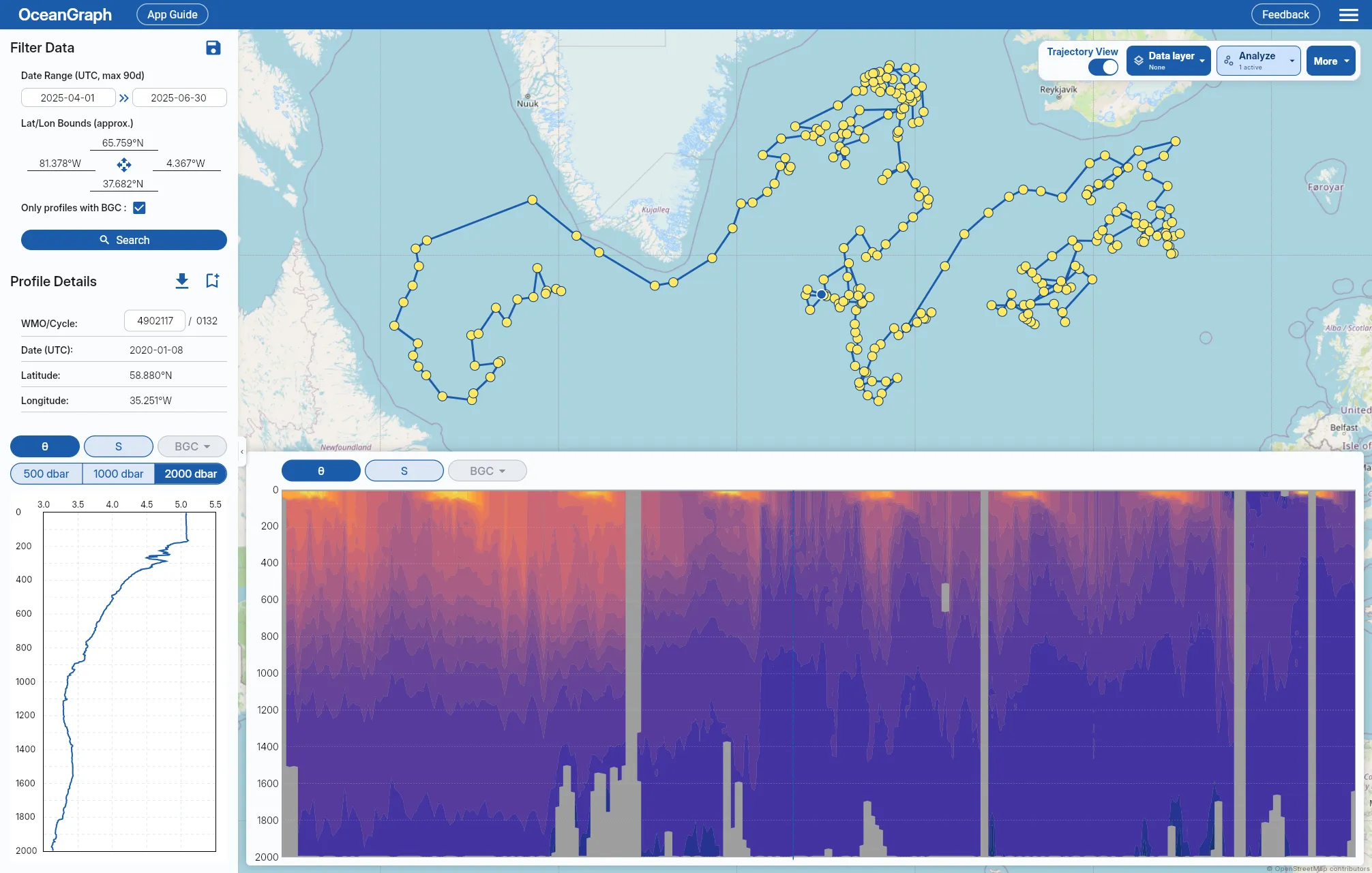
OceanGraph supports this workflow here:
Time-Series Vertical Sections in Oceanography Explained covers how to read the axes, float path, and missing areas in this view.
4. Temperature-Salinity Diagrams: What Kind of Water Is This?
A T-S diagram or θ-S diagram is one of the most useful diagnostic plots in physical oceanography.
Instead of showing how one variable changes with depth, it shows how temperature and salinity occur together. This makes it easier to identify:
- Water-mass signatures
- Mixing-like relationships
- Density-related structure
- Differences that are hard to see from one variable alone
If vertical profiles tell you where a transition happens, a T-S view helps tell you what kind of water the transition represents.
If you want a beginner-friendly interpretation guide, see T-S Diagrams in Oceanography Explained (With Examples).
5. Time Series: How Does One Variable Evolve at One Place or One Platform?
A time series is useful when the primary question is temporal variability.
This can mean:
- How a float’s observations change cycle by cycle along its drifting path
- How one parameter evolves seasonally
- Whether a feature is recurring or unusual
Time series are powerful when you already know which variable and location matter.
That is why many learners benefit from seeing map context and vertical structure before narrowing to a time series.
A Practical Example: One Question, Several Views
Imagine you want to understand whether a set of profiles in the subtropical ocean shows similar deep properties but variable upper-ocean conditions.
A practical workflow would look like this:
- Use a map to confirm the region and the observation path.
- Open trajectories to see whether the profiles come from one float over time.
- Compare vertical profiles to inspect the surface layer, main gradients, and deeper water.
- Open a θ-S diagram to see whether the deeper water remains compact while the upper layer spreads more broadly.
- Use a time-series section to see how the upper-ocean pattern changes cycle by cycle, remembering that the float changes location as well as time.
Visualization Tools and Their Uses
In practice, most people use one of four routes.
| Tool | Suitable uses |
|---|---|
| Static figures in papers or slides | Annotated results, teaching, publication |
| Python notebooks and scripts | Custom calculations, reproducible batch processing, publication figures |
| GIS or map-focused tools | Geographic patterns and regional overviews |
| Interactive ocean data viewers | Profile comparison, teaching, early exploration |
Once you begin writing analysis code, reproducibility depends on more than the script itself. Git and GitHub record how the code changed and which version produced a result, Docker makes the software environment reproducible, and a validation workflow helps prevent incorrect coding-agent output from entering the analysis.
Building the visualization itself as a web application is a separate design problem. From NetCDF to the Browser: Designing a Web App for Ocean Data covers where to place preprocessing, delivery, and browser rendering along that path.
For image-based projects, another early step is turning survey images into labeled data. Getting Started with Marine Image Annotation Using Label Studio and SAM explains the annotation concepts and how to build an environment for trying the workflow.
OceanGraph Workflow: A Practical First Step
OceanGraph is useful because it keeps several important visualization modes close together.
With OceanGraph, you can:
- Search real Argo profiles by region, time, and WMO ID
- Keep geographic and cycle context visible
- Inspect trajectories and time-series sections
- View selected vertical profile graphs
- View θ-S structure without building the plot manually
Useful entry points are: