
On this page
A T-S diagram shows how temperature and salinity relate to each other within seawater, making it easier to recognize water-mass signatures, mixing-like relationships, and density-related structure than by looking at temperature or salinity alone.
For beginners, the challenge is that a T-S diagram often looks abstract at first. A vertical profile is intuitive because depth is visible on the axis. A T-S diagram removes depth from the main view and instead shows the relationship between two properties. That shift is exactly why it is powerful, but it is also why many people ask: how do you actually read a T-S diagram?
What Is a T-S Diagram?
A T-S diagram is a plot of temperature on one axis and salinity on the other. In oceanography, it is used to understand the physical structure of seawater.
Instead of asking only:
- How does temperature change with depth?
- How does salinity change with depth?
you ask a more diagnostic question:
- What combinations of temperature and salinity occur together in this water column?
That matters because many oceanic water masses are defined not by temperature alone or salinity alone, but by their combination.
For a closer look at how oceanographers define and identify water masses—and at the limits of using a T-S diagram for that purpose—see What Is a Water Mass? Reading Temperature, Salinity, and T-S Diagrams.
In practical terms, a T-S diagram helps you:
- Recognize signatures consistent with distinct water masses
- See relationships that may be produced by mixing
- Compare profiles from different regions or seasons
- Interpret density structure more clearly
If you are new to Argo data, it helps to first understand what a profile represents. This article pairs well with What is Argo Float? A Complete Guide to Ocean Observation Data.
T-S vs θ-S: What Is the Difference?
The label T-S diagram is used loosely, so always check the axes and units. A plot can use in-situ temperature with Practical Salinity, while a classical θ-S plot uses potential temperature with a stated salinity scale; historically that salinity was often Practical Salinity. Under TEOS-10, the recommended variables for thermodynamic calculations are Conservative Temperature (CT) and Absolute Salinity (SA).
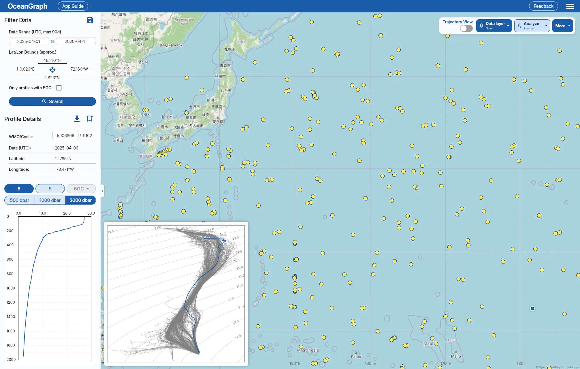
OceanGraph specifically plots potential temperature (θ) against Absolute Salinity (SA) and labels the feature a θ-S Diagram. That is a valid property-space view, but it is not the same variable pair as a TEOS-10 SA-CT diagram. The general interpretation is related, while quantitative density calculations must use variables that match the chosen equation of state.
OceanGraph’s feature guide is here:
Why Oceanographers Use T-S Diagrams
A vertical profile tells you where properties occur in the water column. A T-S diagram tells you what kind of water you are looking at.
For example:
- Two depths may have similar temperature but different salinity
- Two regions may have similar salinity but very different thermal structure
- A smooth profile in depth space may reveal multiple water types in T-S space
This is why T-S diagrams are fundamental in physical oceanography. They compress a lot of information into one view and often reveal patterns that are hard to see in separate line plots.
How to Read a T-S Diagram
The easiest way to read a T-S diagram is to go step by step.
1. Check the axes first
In most oceanographic T-S plots:
- The horizontal axis is salinity
- The vertical axis is temperature or potential temperature
Higher salinity is farther to the right. Warmer water is higher on the figure. Colder water is lower.
This means:
- Upper-right often represents warm, salty water
- Upper-left often represents warm, fresher water
- Lower-right often represents cold, salty water
- Lower-left often represents cold, fresher water
2. Look at the overall shape of the profile
A single ocean profile plotted in T-S space often appears as a curve rather than a straight line. That curve represents how the water properties change through the water column.
Ask:
- Is the curve compact or broad?
- Does it have bends or distinct segments?
- Does it cluster in one region or span a wide range?
A narrow curve may suggest a relatively simple structure. A profile with bends or separated clusters may suggest multiple layers or water masses.
3. Look for groups, branches, or mixing lines
Different shapes often imply different processes:
- A tight cluster can indicate a relatively uniform layer
- A curved path can reflect stratified vertical structure
- A path between two end-members can suggest mixing
- Separated branches can indicate distinct water types sampled together
Look for whether the water properties vary continuously or whether the plot hints at distinct regimes.
4. Use potential-density contours if they are shown
Many T-S diagrams include potential-density contour lines. Check their definition and reference pressure: for example, TEOS-10 sigma0 is potential density anomaly referenced to 0 dbar and takes Absolute Salinity and Conservative Temperature as inputs. A contour calculation must match the variables on the axes.
When density contours are present, you can ask:
- Do points lie along a similar density range?
- Does the profile cross density contours rapidly?
- Are different water groups aligned with different density levels?
This helps connect the T-S relationship to buoyancy, but the diagram has removed depth and vertical ordering. Contours alone therefore do not establish whether the observed water column is statically stable; check the corresponding vertical profiles.
5. Compare multiple profiles, not just one
A single T-S diagram is informative, but comparisons are where interpretation becomes more powerful.
For example, comparing profiles can show:
- Seasonal shifts in surface water
- Regional differences in salinity structure
- Repeated deep-water signatures with changing upper-ocean conditions
- Similar deep water but different mixed-layer properties
Example 1: A Stratified Water Column
Imagine a profile with:
- Warm, relatively fresh surface water
- Cooler, saltier subsurface water
- Cold deep water with more slowly varying properties
On a T-S diagram, this may appear as a curve that begins in the upper-left to middle-left part of the plot, then moves downward and to the right as the water becomes cooler and saltier with depth.
What this tells you:
- The surface layer is influenced by heating, rainfall, runoff, or other freshening processes
- The subsurface contains denser water with a different temperature-salinity signature
- The deeper part of the profile becomes more uniform
On a depth plot, you would see vertical gradients. On a T-S diagram, you see that these layers are not just changing with depth; they represent different combinations of water properties.
Example 2: Mixing Between Two Water Types
Suppose you have one warm, salty water mass and one cool, fresher water mass. If they mix, the points on the T-S diagram often fall along a path between those two end-members.
This is one of the most useful interpretations in a T-S diagram:
- End-member A occupies one corner of the plot
- End-member B occupies another
- Intermediate points suggest mixed water
This does not mean every straight-looking pattern proves simple two-component mixing. Advection, unresolved variability, and the choice of temperature and salinity variables can also shape the curve, and seawater’s nonlinear equation of state means a mixing path need not be exactly straight.
For beginners, this is a good habit:
- Identify the extremes on the plot.
- Ask whether the intermediate values connect them smoothly.
- Compare with the vertical profile to see where that transition occurs in depth.
Example 3: Comparing Profiles From Different Conditions
T-S diagrams are also useful when you want to compare:
- Summer vs winter profiles
- Coastal vs offshore stations
- One Argo float cycle vs another
Often the deepest part of the T-S structure stays relatively similar within the compared observations, while the surface layer moves more noticeably. This can tell you that:
- The sampled deep-water signatures changed less over that interval
- Surface conditions respond more strongly to season and atmosphere
- The upper ocean is where most short-term variability is happening
This is a strong example of why ocean profile data visualization should not stop at one plot type. The T-S view helps you compare water properties directly, while the depth view shows where those differences sit in the water column.
Making a T-S Diagram: Python vs Interactive Tools compares the two workflows when your question is how to create the diagram rather than how to interpret it.
A Better First Step: Explore T-S Structure Interactively
With OceanGraph, you can:
- Search real Argo profiles by region and time
- Compare profile context before interpreting the T-S structure
- View a θ-S diagram generated from the current search area
- Highlight selected profiles on top of the background distribution
Useful starting points: