
On this page
You can make a T-S diagram with Python or an interactive browser tool. Python suits custom calculations and batch processing; tools such as OceanGraph suit profile search and comparison.
If you want to understand how to read the finished plot, pair this article with T-S Diagrams in Oceanography Explained (With Examples).
What You Need Before Making a T-S Diagram
No matter which workflow you use, the basic ingredients are similar.
You need:
- Profile data with temperature and salinity information
- Enough context to know where and when the profile was collected
- A way to compare one profile or multiple profiles
- A clear reason for looking in T-S space rather than depth space alone
In practice, it also helps to understand the profile first. If you have not yet done that, How to Read Argo Float Data for Beginners (What to Look at First) and Ocean Temperature and Salinity Profiles Explained are useful preparation.
For interpretation, check the exact variables rather than relying on the title alone. T-S may use in-situ temperature and Practical Salinity; classical θ-S uses potential temperature and a stated salinity scale; TEOS-10 thermodynamic work generally uses Conservative Temperature and Absolute Salinity. OceanGraph’s θ-S Diagram specifically uses potential temperature and Absolute Salinity.
The Python Workflow
Python is a powerful way to make a T-S diagram, especially if you need full control.
Downloading the data
The first step is usually to obtain the relevant profile data.
That may mean:
- Downloading Argo profile files
- Selecting a float by WMO ID
- Narrowing the data by region or date
- Deciding whether one profile or many profiles should be included
Reading NetCDF files
Once you have the files, you need to open them and identify the variables you actually want to plot.
In a Python workflow, that usually means working with:
- NetCDF structures
- Array dimensions
- Metadata conventions
- Quality information
Cleaning temperature and salinity values
Before plotting, you often need to decide:
- Whether the Argo data mode requires raw or adjusted variables
- Which temperature and salinity definitions the axes will use
- Which matching quality flags and error estimates to apply
- How to handle missing values
- Whether to calculate potential or Conservative Temperature and Practical or Absolute Salinity
Converting Practical Salinity to Absolute Salinity requires pressure, longitude, and latitude; temperature conversions require pressure and a clearly stated reference or TEOS-10 convention.
Plotting the diagram
- Put salinity on the horizontal axis
- Put temperature or potential temperature on the vertical axis
- Plot one profile or many profiles
- Add potential-density contours calculated from variables consistent with the axes and a stated reference pressure, if needed
- Adjust labels, ranges, and styling
The Interactive Workflow
An interactive workflow flips the order. Instead of preparing code first, you inspect the data first.
Search for a float or profile
Start by narrowing the profiles you care about.
In OceanGraph, this means using the search workflow to filter by:
- Region
- Date range
- WMO ID
- Available profile characteristics
The search entry point is here:
Open the T-S view
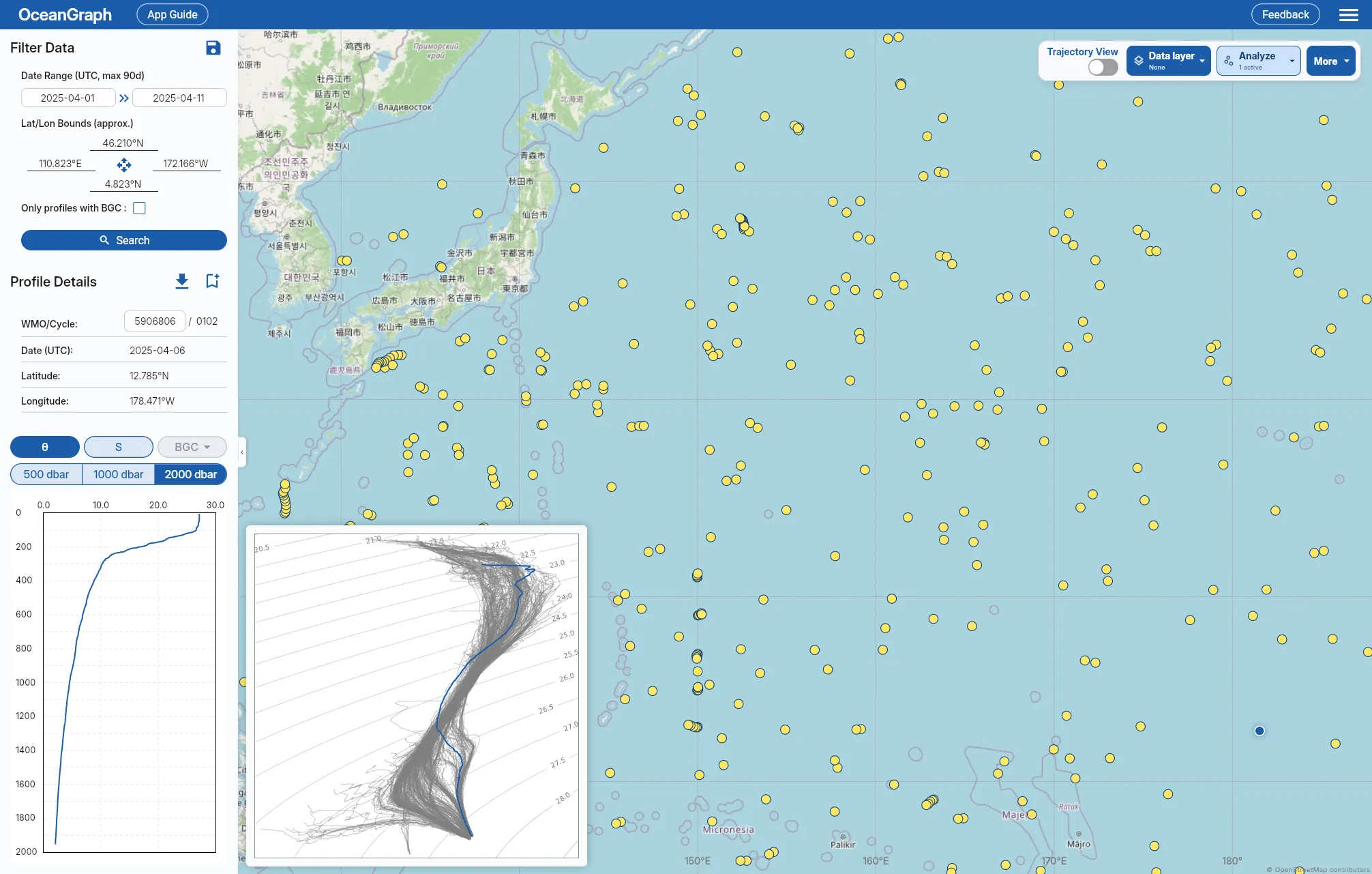
Once the search results are in place, you can open the θ-S diagram view.
OceanGraph generates the diagram from the current search area, which means the T-S view stays connected to the actual profile set you are exploring rather than being detached from context.
The feature overview is here:
Compare profiles without writing code
In OceanGraph, you can:
- Search for relevant profiles
- Read the vertical profile first
- Open the θ-S view second
- Compare selected profiles against the broader background distribution
If you want the no-code exploration workflow in more detail, see Visualizing Argo Float Data Without Python (Step-by-Step Guide).
Python vs Interactive Tools: A Practical Comparison
| Question | Python workflow | Interactive workflow |
|---|---|---|
| Time to first diagram | Slower | Faster |
| Setup required | Higher | Lower |
| Control over plotting details | Very high | Moderate |
| Best for screening profiles | Less convenient | Very convenient |
| Best for batch processing | Strong | Limited |
| Best for teaching or first interpretation | Often heavier | Strong |
| Best for final custom analysis | Strong | Usually a first step |
When Python Is Still the Right Choice
Python remains the better option when you need to:
- Process many profiles in bulk
- Reproduce a figure exactly in a script
- Add custom derived calculations
- Merge Argo data with other datasets
- Generate publication-ready plots in a controlled pipeline
When an Interactive Tool Is the Better First Step
An interactive tool is often the better first step when:
- You are learning how T-S diagrams work
- You want to inspect real data quickly
- You are screening profiles before deeper analysis
- You need to compare observations without building a full code workflow
- You want to connect the T-S view directly to the vertical profile and search context
Example Workflow: From First Look to Deeper Analysis
A pragmatic workflow often looks like this:
- Search for profiles in OceanGraph by region, date, or WMO ID.
- Check the observation context.
- Open the vertical profiles and identify which cases are interesting.
- Open the θ-S diagram to examine the property-space structure.
- Select profiles that show distinct layering, clustering, or mixing-like behavior.
- Return to Python later only for the subset that deserves custom analysis.
OceanGraph’s related pages for this workflow are:
- Search and Bookmark
- Analysis Lab: Vertical Profiles (JSON upload)
- θ-S Diagram
- T-S Diagrams in Oceanography Explained (With Examples)