On this page
A time-series vertical section is useful because it turns a sequence of profiles into one view that shows how a variable changes through the observation sequence and depth. For a drifting Argo float, this is not a fixed-location time series: time and geographic position both change.
If you want the broader overview of plot types first, start with Ocean Data Visualization: Methods, Examples, and Tools.
What Is a Time-Series Vertical Section?
A time-series vertical section takes repeated vertical profiles and arranges them in order.
In an Argo workflow, that usually means:
- One float observed over many cycles
- Time or observation sequence along the horizontal axis
- Pressure or depth along the vertical axis
- Color showing the value of one parameter such as temperature, salinity, or oxygen
This is useful because it lets you see how sampled water-column structure changes from one observation to the next along the float path.
Instead of asking “what does this one profile look like?” you can ask:
- Is the upper layer becoming more stratified or more mixed?
- Does the thermocline deepen or shoal over time?
- Is a subsurface feature persistent or temporary?
- Do deeper properties remain similar while the surface changes?
How Deep Do Ocean Seasons Reach? provides a question-first example of the upper-ocean change that a longer section may reveal.
How to Read the Axes, Colors, and Float Path
The easiest way to read a time-series vertical section is to break it into four parts.
1. Read the observation sequence across the section
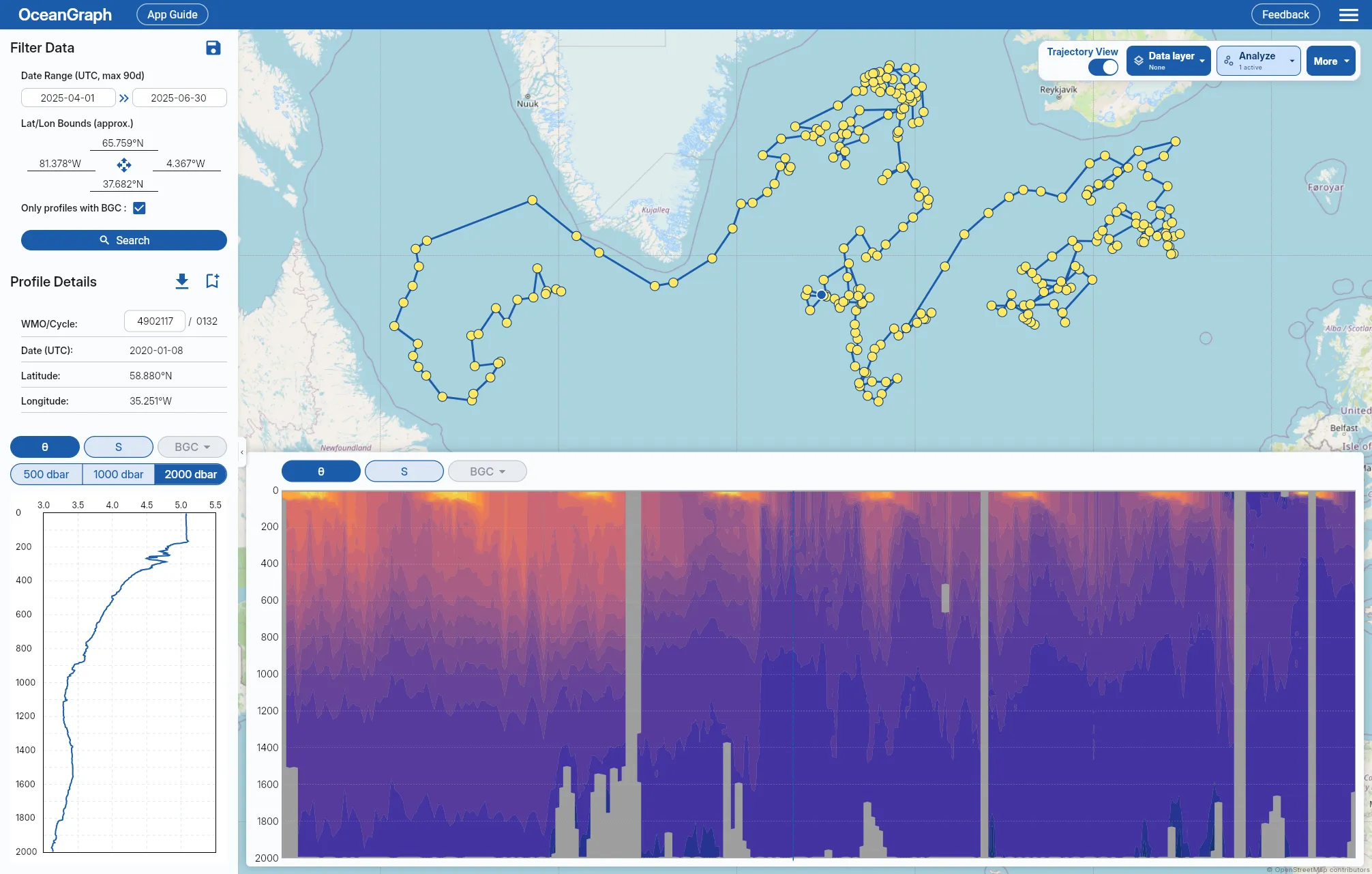
The horizontal axis usually represents the sequence of observations through time. In OceanGraph, the section grid is indexed by cycle number, not by elapsed calendar time. Equal horizontal spacing therefore means equal cycle-number increments; it does not guarantee equal time intervals between profiles.
2. Read pressure or depth downward
The vertical axis shows the water column.
As with profile plots, higher pressure or greater depth means deeper water. Surface variability often appears near the top of the section, while more slowly varying deep structure appears lower down.
This makes it easier to separate shallow seasonal change from deeper persistence.
3. Read the variable distribution from color
The color shading is the actual data pattern.
Depending on the selected parameter, color can reveal:
- A warm or cool surface layer
- A salinity maximum or minimum
- An oxygen-rich or oxygen-poor layer
- A boundary that shifts upward or downward over time
Read the colored regions as structure. Ask where strong gradients occur and whether they remain in similar depth ranges or move with time.
4. Keep the trajectory in mind
A time-series section is easier to interpret when you also know where the float moved.
If the platform drifts into a different water-mass region, the section can change for geographic reasons, not only seasonal ones. That is why trajectory context is important.
OceanGraph keeps this logic explicit in:
What a Section Reveals Better Than a Single Profile
A single profile is clear, but a section is better for pattern recognition across time.
A section helps you see:
- Whether the upper ocean changes while deep water stays similar
- Whether a gradient strengthens, weakens, shoals, or deepens
- Whether a feature appears across many cycles or only once
- Whether one odd profile is really unusual or part of a trend
Imagine a float in a subtropical region observed across several months. A section might show:
- A warm near-surface layer that thickens in one part of the record
- A strong thermocline that moves vertically over time
- Much smaller change below several hundred decibars
- A few cycles with sparse or missing values after QC
That is much harder to understand by opening the same profiles one at a time.
Sections also work well with diagnostic comparisons. If one part of the section looks unusual, the next step is often to open the matching profile and then check a T-S Diagrams in Oceanography Explained (With Examples) style view for property-space interpretation.
What Missing or Gray Areas Mean
In OceanGraph, each profile’s finite values are interpolated onto a regular pressure grid only inside that profile’s observed range. Cycle-number columns are not interpolated. A missing cycle remains missing, so a smooth band cannot bridge an unobserved horizontal interval. Missing or masked areas can appear for several reasons:
- Original observations were not available in that part of the grid
- Quality control removed too many values
- Adjacent cycles did not share enough finite vertical support to form a drawable contour cell
- BGC parameters had fewer valid observations than physical variables
These gaps indicate insufficient data to color the area, not a zero value for the variable.
OceanGraph’s limitation notes explain this in more detail:
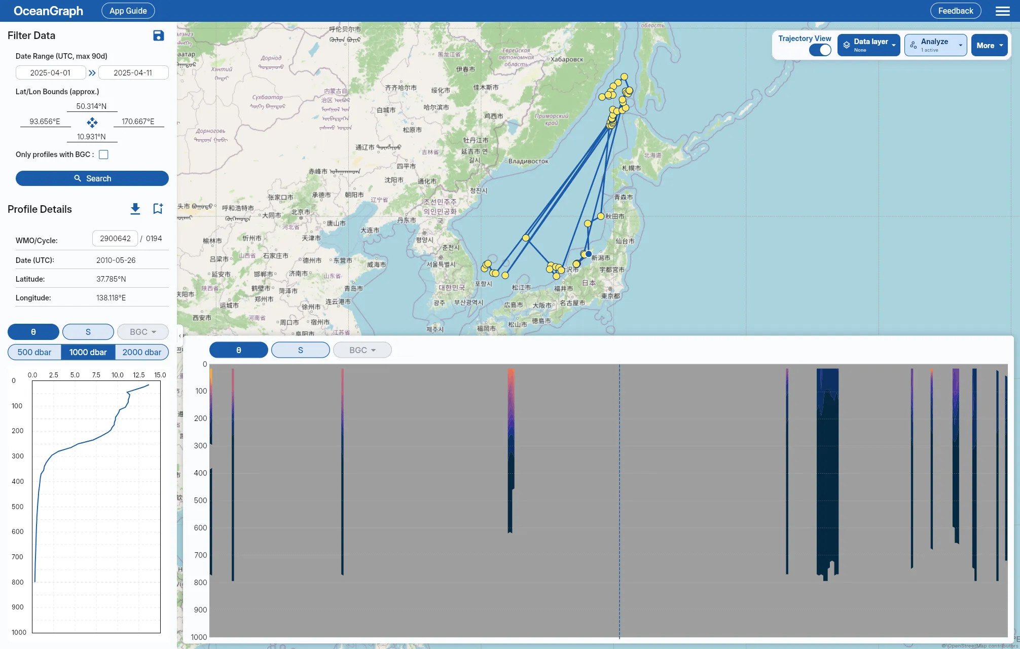
For BGC-related variables, gaps can be even more common because fewer floats carry those sensors in the first place. When such a parameter only appears in scattered cycles, there may be no drawable section at all, and OceanGraph says so instead of showing an empty chart.
Color gradients can look smooth even when the underlying observations are sparse. Check sampling intervals and quality information in the corresponding profiles.
The Traditional Workflow: Assemble Many Profiles, Interpolate, Then Plot
If you build a time-series vertical section manually, the workflow usually looks like this:
- Gather many cycles from one float or sequence
- Read each profile from NetCDF
- Apply quality control decisions
- Interpolate the irregular observations onto a common grid
- Plot the gridded field
- Cross-check the section against the original profiles
A Better First Step: Read the Section Interactively
If your immediate goal is interpretation, OceanGraph is often the better starting point.
A practical workflow is:
- Search for a float or relevant profile set.
- Select the float in the results or map view.
- Turn on trajectory mode.
- Open the vertical section view.
- Use the dashed line and profile linkage to inspect specific cycles more closely.
Useful related pages are: