On this page
Ocean profile clustering groups profiles under a chosen definition of similarity, making it possible to explore patterns and contrasts in vertical structure across a collection. Rather than checking hundreds of temperature and salinity curves one by one, it can help identify recurring structures, profiles with structure unlike most of the selection, and how each group is distributed in space or time. Choosing representative profiles for closer inspection is one use.
A cluster groups selected profiles that are close under the chosen calculation settings. Its meaning must be established by looking back at the profiles, their locations, and their observation times.
For an overview of the displays that come before clustering, see Ocean Data Visualization Methods: Examples and Tools.
What Clustering Does
Clustering is an unsupervised learning method. It receives observations without predefined class names and groups observations that are close under a chosen representation and distance measure.
For ocean profiles, each observation begins as one or more curves over pressure. The curves cannot simply be handed to an algorithm in their original form because profiles differ in sample depths, valid coverage, and units. They first need a common feature representation.
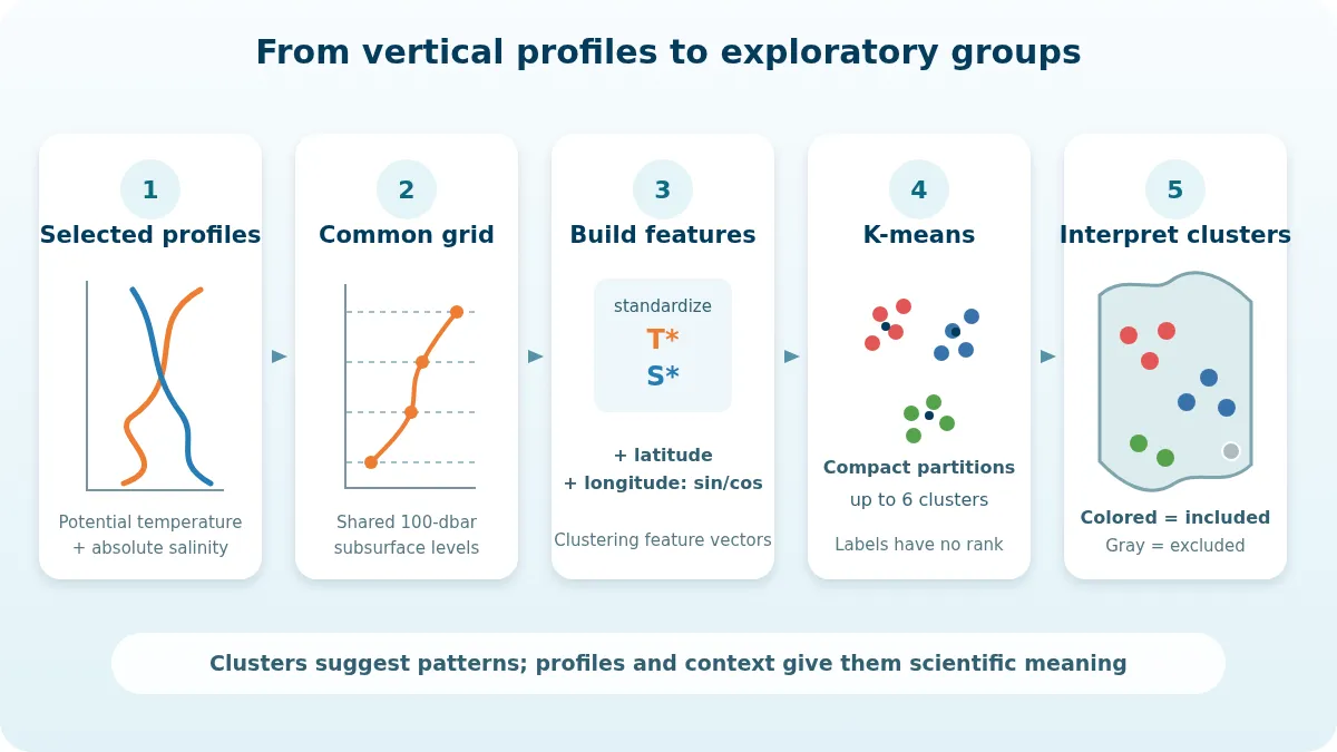
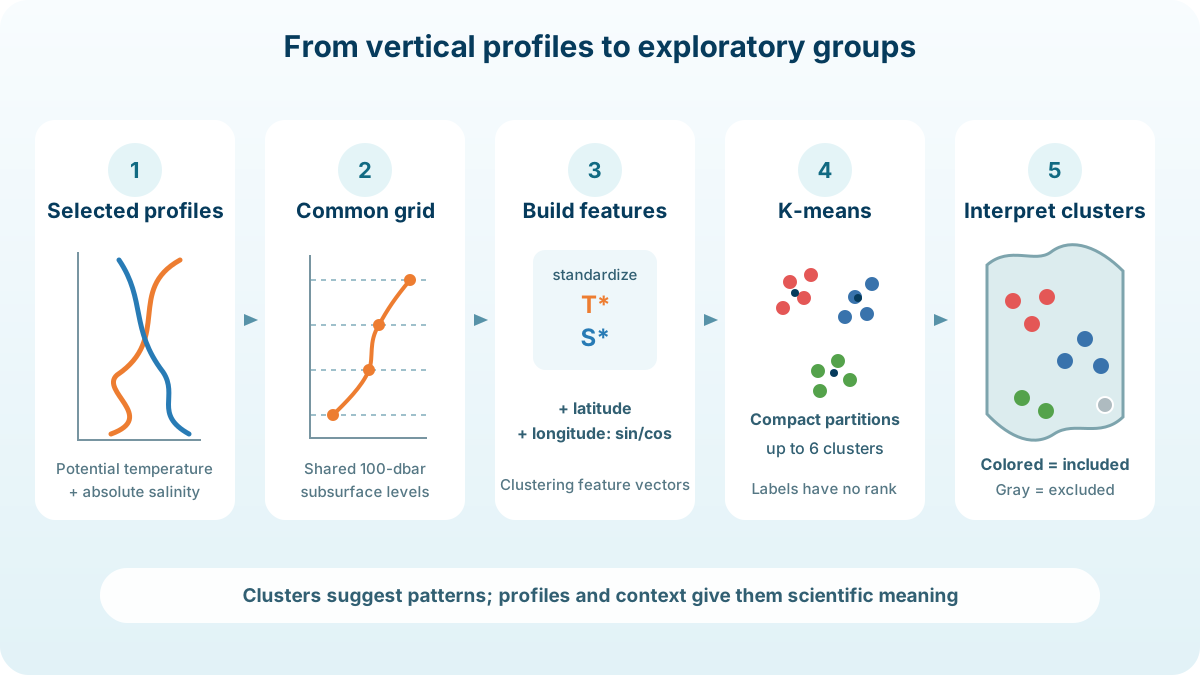
A basic workflow is:
- Select profiles from a defined region and time range.
- Put valid variables onto a shared pressure grid.
- Scale the features so one depth or variable does not dominate only because of its numerical range.
- Optionally include spatial or temporal context.
- Partition the resulting feature vectors.
- Return the labels to maps and profile plots for interpretation.
Every choice changes what “similar” means. Clustering results are therefore inseparable from their preprocessing and input selection.
What OceanGraph Currently Compares
OceanGraph’s clustering feature uses the profiles currently loaded for the active map view—normally the current search results, or the profiles shown in trajectory mode. By default, it compares subsurface physical structure together with geographic position, represented by latitude and longitude features, while reducing emphasis on highly seasonal near-surface structure.
| Stage | Current behavior | Why it matters |
|---|---|---|
| Variables | Paired finite potential temperature and absolute salinity | Both physical profiles must be usable at the same levels |
| Pressure range | Begins at 200 dbar and uses a shared automatically selected maximum, normally no deeper than 1,000 dbar | Reduces emphasis on highly seasonal near-surface structure and avoids comparing depths that many inputs do not reach |
| Grid spacing | 100 dbar | Makes every included profile comparable at the same pressure levels |
| Scaling | Each temperature and salinity level is standardized across the included profiles | Prevents features with larger raw numerical ranges from dominating distance |
| Geographic context | Latitude and longitude features | Keeps geographic position in the comparison alongside vertical structure |
| Grouping | K-means with an automatically selected number from two through at most six clusters | Produces a compact exploratory partition |
OceanGraph interpolates the paired temperature and salinity values to the shared grid for this calculation. This interpolation is an analysis step for clustering.
The automatically selected maximum pressure is based on the usable depth coverage of the submitted profiles and is rounded to the 100-dbar grid. Profiles that cannot support the shared range are excluded rather than silently filled.
Why the Shared Grid Matters
Imagine three profiles:
- Profile A samples 200, 300, 400, and 500 dbar.
- Profile B samples 205, 298, 402, and 503 dbar.
- Profile C stops at 350 dbar.
A and B may describe nearly the same vertical structure, but their sensor levels do not match exactly. Interpolation to a common grid makes their values comparable. C cannot contribute to comparisons that require 400 and 500 dbar, so exclusion is more honest than inventing its deeper structure.
This is why a gray excluded point on the OceanGraph map is not a failed cluster. It means the profile did not meet the common valid-data requirements used by that clustering run.
Why Standardization Matters
K-means groups rows using distances in feature space. Without scaling, a feature with a larger numerical spread can dominate that distance even if it is not scientifically more important.
OceanGraph standardizes temperature and salinity separately at each pressure level across the included set. A one-unit feature difference then represents its position relative to the variability at that level, not simply one degree Celsius or one gram per kilogram.
This makes the calculation more balanced, but it also makes the result dataset-dependent. Change the selected region or time range and the means, standard deviations, and cluster boundaries can change.
Why Location Is Included
Two nearly identical profiles on opposite sides of an ocean basin may reflect different circulation settings. OceanGraph therefore includes geographic coordinates alongside the vertical features by default.
With location included, the result answers “which profiles are similar in structure and geographic context?” rather than “which curves have the same shape regardless of where they occurred?”
How K-means Forms the Groups
K-means places a specified number of centers in feature space and repeatedly assigns each observation to its nearest center and updates the centers. Its objective is to reduce the within-cluster sum of squared distances.
OceanGraph tests between two and six clusters and automatically selects one result for display. This keeps the display manageable, but it does not prove that the ocean contains exactly that many natural regimes.
The scikit-learn clustering guide explains the objective and important K-means assumptions. In particular, K-means favors compact, roughly isotropic groups and can give unintuitive partitions when the actual structure has irregular shapes or very different densities.
How to Read the OceanGraph Result
The clustering result colors included profiles by group and shows excluded profiles in gray.
1. Ignore the apparent rank of label numbers
Cluster 0 is not lower, earlier, colder, or more important than cluster 1. Labels are arbitrary identifiers and can change between different runs.
2. Inspect several profiles from each group
Compare several vertical profiles in the group and look for structural features they share and differences from other groups.
3. Compare physical diagnostics
Choose representative profiles from each group and compare their temperature-salinity relationships with θ-S Diagrams in Oceanography Explained. Maps, vertical sections, and time plots can reveal whether a cluster follows a front, current, season, or sampling boundary.
4. Examine cluster boundaries
A sharp color boundary may describe an oceanographic front, but it may also follow the search box, date range, depth coverage, or geographic feature weighting. Check the input selection before assigning a physical name.
5. Keep excluded profiles visible in your reasoning
If exclusions concentrate in one area or period, the result may represent only the deeper or more complete subset. That sampling pattern belongs in the interpretation.
A Practical OceanGraph Workflow
- Use Search to define a scientifically coherent region and time window.
- Narrow the search results to 500 profiles or fewer.
- Open Clustering and submit the loaded profiles.
- Inspect the colored map for spatial coherence.
- Open representative vertical profiles and θ-S diagrams for every cluster.
- Repeat with a narrower region or season if the first result mixes several questions.
- Export the data and reproduce a tailored analysis in code when you need different variables, depth spacing, distance metrics, or validation.
The OceanGraph Clustering guide documents the interface, limits, status display, and cancellation flow. For the preceding discovery step, use the Search and Bookmark guide.
If you prefer to inspect profiles before any grouping, Visualizing Argo Float Data Without Python provides a browser-first workflow.